Monday, 9 December 2013

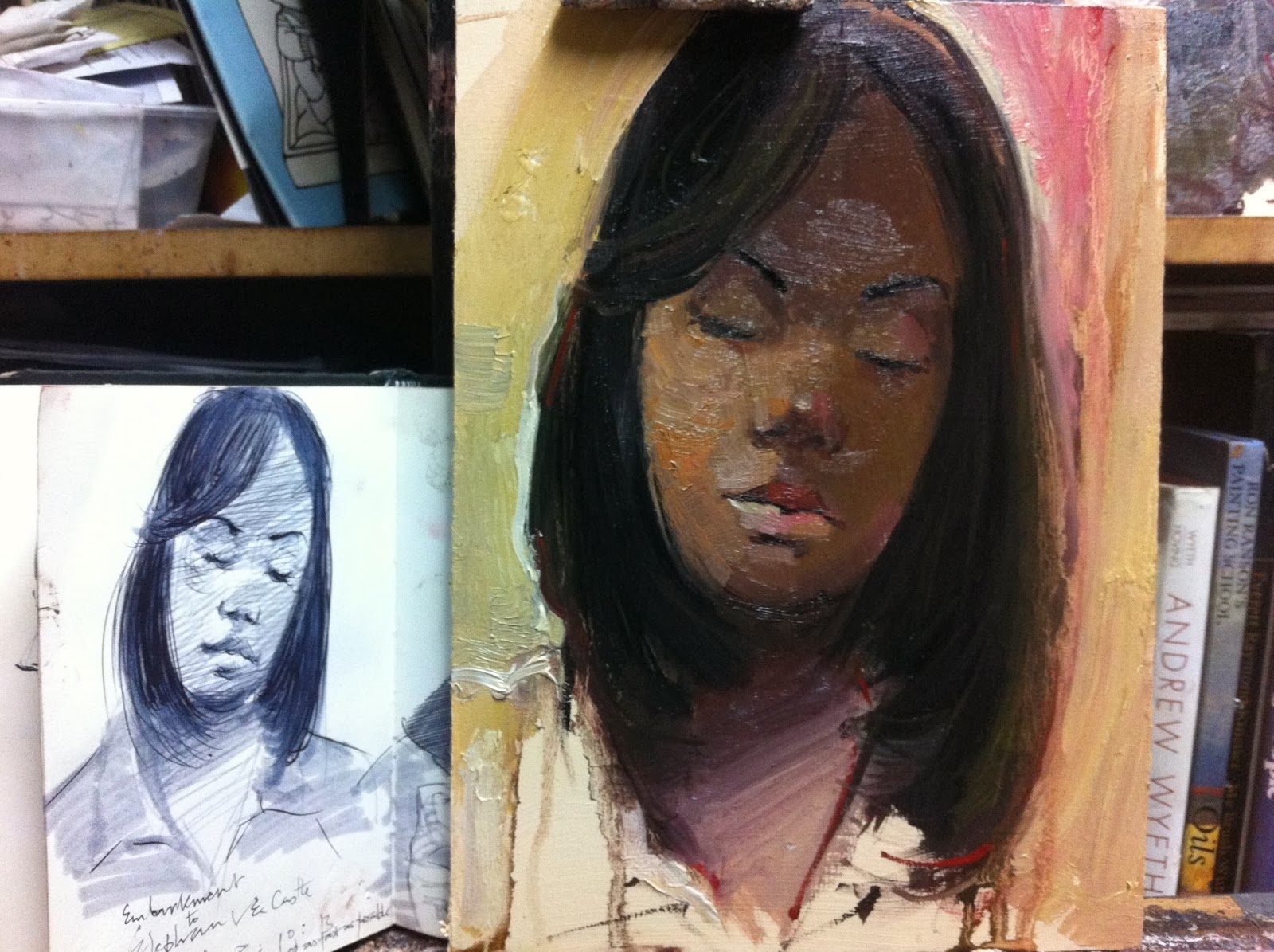
The Dream, Oil on board, 8" x 10", 2013

I don't think many of us could dream on public transport. But when it comes to titles, anything can pass for a good one. I transformed this sketch of a young lady I saw sleeping on the train on London Underground from Embankment to Elephant and Castle on The Bakerloo Line. I really sketched as fast as possible and I was so happy with the result.

The Dream, 8" x 10" Oil on Board, 2013
 If you would like to purchase this work, you can click HERE


The Original Sketch for "The Dream"

Here's how I went about this one.

  1.  I used my usual limited palette of 4 colours The Zorn Palette). (Titanium White, Cadmium Red, Yellow Orche and Ivory Black.
  2. I didn't make a preliminary sketch to start this one off, I was so inspired, I just went straight into placing large patches of colour on the surface to plan the way her face would be, value wise.
  3. Once I had all the large shapes placed on the board, I added the brief notes of a washy background.
  4. It was after this that I then sketched the features on the face tones. It was almost like drawing on a painted surface.
  5. I was working really fast without thinking most of the time but I really wanted this piece to have a sketchy feel.
  6. In someways it almost looks a bit flat but I made a bit of adjustments around the left side of her face, where the light hits her face.
  7. I did my best to keep this piece simple and you can see from the picture below how it looked while working on it.

Work in progress on the easel

Saturday, 23 November 2013

The Nightmare!!!, Oil on Board, 10" x 8", 2013

THE NIGHTMARE!!!, Oil on Board, 10" x 8", 2013
To Purchase this painting, please click on the link HERE


This is another transformation that I really enjoyed! I took some liberties here and made a lot of creative and imaginative additions to suit the title I decided to give the painting.


The actual sketch had nothing to do with a nightmare, it was actually of a lady who sat in front of me while traveling to York recently. She was awake for most the journey, enjoying her book, snacks and an occasional phone call. She seemed to me a delightful person!

But I kept getting absorbed by her features and how she would look great if I got the opportunity to pull out my sketchbook and make a quick sketch of her.

Then all of a sudden some few minutes before getting to York, she slept off! Ahah!! I got my sketching stuff out and did a "Quckie", once I finished it was just about the time when the train got to York. I tapped her and showed her the sketch, she just said, "thank you for that!".

We both departed happy souls! There's never a dull day for me when I get to show the commuters I sketch everyday, the sketch that I have done of them.

Lest I forget the transformation was done completely from imagination and the original sketch.  The original sketch was done with a BIC black ball point pen with a N75 TOMBOW Dual Brush Marker.

How I went about it.

  1. I used only 4 colours for this painting. The Anders Zorn palette, which consists of Titanium White, Cadmium Red, Yellow Ochre and Ivory Black. 
  2. I worked on an MDF board, 10" x 8"-I gave it a wash of Yellow Ochre and White in acrylics to remove the white glare of the primer.
  3. I stared by sketching it all out with a wash of red and black.
  4. I made sure I started with lean colour mixtures, these are mixtures that have less paint and more turps.
  5. I was careful to make sure that I painted the shadow shapes on her face first before adding the lights with thicker mixtures.
  6. Some people ask me how I manage to get the skin tones. Well, basically I just work out what I think I'd be mixing if I was looking at her in real life, I always observe colour temperature and tones on people I sketch and even without making notes I just remember what the closest mixture to it would look like. Remember these sketches are not about accuracy but they are a good challenge to see how well we can combine observation with intuition, which I think is valuable for the development of all representational painters.
  7. Once satisfied with the face I added the glasses and then went for the background. I just went crazy with the background because I didn't have much information in the sketch to take it much further.
  8. Then finally I added some really gestural and organic strokes to add to the mystery of the piece.


The sketch for nightmare- there's nothing like the original sketch! but it's always good to see how far we can push our sketches and take them further. Just start from somewhere and see what progress you'll make!

Wednesday, 28 March 2012

The BIG ISSUE SELLER Colour version 1


The Colour Version, 8" x 10", Oil on Board, 2012


The post that would be coming up here in the next few months would be how I convert my black and white sketches of Big Issue Sellers to Oil Colour sketches.

Stage 1


Here I sketch in oil the sketch on the board using a grid reference for accurate transfers. The program I use is called Accurasee you can download it for free and it is great for accurate grid scaling. I printed out the sketch to the proportion of the painting I was working on and did the initial sketch with a mixture of vermillion and black. Looking at my palettre you can see I have only 4 colours for this painting. Its a Zorn palette and I love it. I also did the same proportional grid lines on my board.


Stage 2


Here I do the initial broad block-in shapes to cover the whole face. working from larger dark shapes to smaller lighter shapes.


Stage 3


More detail is added, the goal is to draw into the broad shapes with more precise marks.


Final stage


Here, the refining takes place with a round pointed sable number 2. It's at this stage that the main features are refined and all the edges re-adjusted.


The sketch

Thursday, 8 September 2011

Scarlet Solitude, Oil on Board, 16" x 20", 2011


Today I was a able sketch a homeless guy I have always wanted to sketch.
Once he agreed I just got my studio to do a quick conversion to colour from the sketch without any reference to a colour reference.

I went about it thus

1. The board I used was given a colouful warm underpainting of light and dark tones.

2. I added liquin to the board to add some resistance, so the colours don't sink.

3. I used the Zorn Palette for this piece, which consists of white, yellow ochre, cadmium red and Ivory black. It's a limited palette but very tonal and powerful!

4. I sketched the head in with mixture of red and back.

5.After which I just painted shape by shape from memory and from the sketch to get a feel of how I saw him today.

6. His face came out a bit longer but I was still happy with the result.

Thursday, 17 February 2011

DAZED, 7" x 9.5", Oil on board, 2011


This is another transformation from black and white to colour.

1.I started with a Lightly toned gessoed board,, the colour of the tone was light cream, a mixture I derived from white, yellow ocher and raw umber in acrylic colours.

2. I start to sketch directly with a brush and oil colour slightly diluted, this is a quick colour sketch and I don't plan to spend more than 45 mins. So it's Straight sketching and colour filling as I go along.

3. I start by using a light colour of a mixture that consists of yellow ocher, cadmium red and white, I grey and cool this mixture with a bit of blue. I apply this mixture to all the light planes of the head-forehead Cheeks, jaw, chin....

4. Next I get my dark tone by adding burnt sienna and Ultramarine blue to the mixture above. I apply this to all the dark passages.

5. I then soften the edges between the dark and light passages. and this creates a more solid looking face.

6. I then accentuate the lights and add darker details like nostrils and eye lashes with the tip of a round long sable brush.

7. I then work on the hood by simply starting from the dark side and moving into the light.

8. Then I add the background with some warm and cool browns to create a hazy background to show he is dazed.

9. I just wanted to do this one quickly to capture the guys mood, one that truly caught my attention in a 453 bus last week. I think I finished it in 30 minutes.
I think these colour sketches are good to train one to quickly capture gestures in colour.

Tuesday, 6 July 2010

LOVE AT FIRST SIGHT II, 8" x 6", mixed media on gessoed card, 2010


This is another transformation of my sketches to colour. I worked from memory with some notes I added on my sketch.

Here I used this sketch as a springboard and went a bit wild with my imagination.

This is how I went about it.

1.I sketched the face on a lightly ochre/brown washed toned surface, with a mixture of Terra Rosa and ultramarine blue.

2. Working this way brings an immediate harmony to the piece as the browns and ochers quickly form a warm colour scheme.

3. Then I used very light washes of skin tones to throw the interplay of light and shade on her face.

4. After this I used a very small sable rigger to put the main features in with delicate touches.

5. Now, I added in the dark "hoody" she had on, and the light beige jacket she was wearing, after this it looked OK and I thought it was fine and finished. I had left the background as the initial wash of ochre/brown, but it didn't bring out her face, there was some sort of clash.

6. So I decided to darken the background, that helped a bit. Then I did a bit of
scratching back with my Biro to enhance some lines and her hair.

7. Then I introduced coloured pencil marks when the piece was touch dry. This helped to spice up the value balance and add a varied mark to the oil brush-strokes.

8. Finally I added more wild strokes with my coloured pencil to spice up the background, so it would have a spontaneous effect that goes along with the title I planned to give the piece.

Thursday, 8 April 2010

MISERY, 8" x 8", Mixed Media on Canvas Board, 2010


This is another transformation from black and white to colour, using no colour references but working from memory. What drew me to this man was his interesting features, even though his face looked a bit hardened, there was a bit of beauty in the midst of the storms. I sketched this guy on the 30th of March last month, so his features were still fresh in my mind.

I went about this piece, thus

1. Stain the canvas board with a mixture of burnt sienna and raw umber oil washes

2. When happy with the background staining. I sketch the face in, with my sable brush pointed to give delicate marks of precision.

3. I went on to finish the sketching with oil washes and some thicker paint in the lighter areas, keeping all my colours with a more tonal feel, something I planned to experiment upon.


4. When the oil dried up, I now tried something quite new, I worked back to get the drawing with a ball point pen(bic biro, as I normally call them)I did this also to create some textures and a "etchy feeling" to the surface.

5. After that, I used some brown coloured pencils to add some light and spontaneity to the face, just to create some mood as it was almost lacking a bit of spark.


6. Then it was time to quit before further ruins

Thursday, 4 February 2010

MACKY, 9" x 12", Mixed Media on Paper, 2010

This is another transformation from memory.

This time I actually requested to sketch this homeless guy for an agreed price for just 5 minutes.


The sketch looked very brief but I worked on the colour transformation a bit more.

Steps
1. I used a canson orange paper

2. Started sketching with watercolour with a flat sable for the basic parts of this portrait.

3. Start under-painting of the whole face and other features with burnt sienna washes of watercolour and olive green.

4. I introduce chalk pastel with broad strokes all over the face and clothes to block in the initial colours

5.I then move on to wax crayons to add expressive strokes and tie up the structure and harmony of colour all over the piece. I love these wax crayons as they are less messy and reveal more of my passion for linear strokes.

6. I then finish up with a soft black oil base pencil to add more detail and recover some of the drawing that gets lost during the expressive wax technique.

7. Call it quits........

Saturday, 5 December 2009

Contemplation, 6.5" x 6.5", Gouache, 2009


This is another transformation purely from memory. I sketched this guy, he must have had a hard day at work. He looked like a builder to me. I loved his face and was quite pleased to get this opportunity to sketch him.

1. Get my museum mountboard and give it an acrylic wash base of cadmium yellow and yellow ocher.

2. I start by placing the main large shapes with my flat sable, no initial drawing in this one.

3. After the main shapes are in place I begin to use a glazing technique to keep laying colours until I get both transparency and opacity in various places as I want.

4.The remaining touches are done to add detail to the main features.

5. I soften the edges around the background by spraying water over the area.

6. I have to stop before this piece gets overworked by the glazing technique.


Thursday, 5 November 2009

"Grumpy Joe" 9" x 12", Pastel on gessoed cardboard, 2009


Another transformation. I sketched this guy yesterday, so his image was still fresh in my memory. I was attracted to sketch him because he had a really interesting face, the kind of face I love to sketch. The only problem was that, I was a bit to far away from him and couldn't really get to see his features clearly. Nevertheless I managed to get the most important bits down and when I got to my studio I quickly did this pastel sketch of it. I have also taken a picture of the set up to show how I laid my pastels, with the working area and reference.


I went about working on this piece as follows.

1. Got my gessoeed cardboard primed with white gesso and a neutral grey tint, which was a mixture of ultramarine blue and cadmium orange.

2. I start by running a few colours of pastel across the surface in a haphazard manner, just to break the plainness of the grey tint.

3.I start from the light areas, working on the big shapes first with all the light coloured pastels I feel will work for his skin tones in the light. There's no real formulae to this, I only respond to intuition.

4. Then I move to the darks and repeat the same process as I did for the lights. Its the big shapes first.

5. Now when the big shapes begin to look good, I start drawing into the shapes with my darker coloured pastels to get some of the features in.

6. It generally looks finished at this point and this is how simple 2 tones and some brief sketching basically bring the face forms to life.

7. Just before I wrap it up, I use some soft thin willow charcoal to sketch in some interesting lines and details, just to add some life to his face and that's it!

8. This was purely an experiment and the pastel medium gives one a lot of room to do that.

Tuesday, 22 September 2009

After a rough day at work, 8" x 10", oil on canvas board, 2009


This is another transformation of one of my sketches into colour.

I sketched this guy last year on the 14th of June as the date reads and I can't really remember what made me sketch him other than the fact that sleeping commuters are the best-No disturbance and they keep still, with the exception of some drifters!

I went about this one, thus:

1. I got my canvas board primed with neutral grey (white gesso with orange and blue acrylic)

2. I started by sketching his face with a a number 2 sable brush, using the tip of it with some Terra Rosa oil paint.

3. When satisfied with the terra rosa sketch, I just started to paint section by section starting from the eyes and moving right round the face, just like a jigsaw puzzle. The colours used were, titanium white, raw umber, lemon yellow, cadmium yellow, yellow ocher, cadmium orange, cadmium red, alizarin crimson, ultramarine blue, viridian green and chromium oxide. The medium used was oleopasto-impasto liquin.

4. When almost all the face had been completed with the neck, I used the tip of my brush to adjust all meeting planes and edges around the face so that it wouldn't look patchy. e.g where the forehead meets the hair.

5. After adjusting the edges, I run over the whole sketch again with the goal of refining the drawing. Also, just going over the sketch gives room for the face not to look overworked but still maintain a sketchy feel.

6. I struggled with the particular flow of light across the planes of the face, as my reference sketch was quite confusing. But because I have use no colour reference and this is just experimental for me, I go with the flow, hoping that the mistakes might even make the face look interesting!

7. I have a look in the mirror and see some sore spots, I refine them and decide to stop.

8. I didn't want to put any background in this one, just to keep it looking like a work in progress.

Monday, 24 August 2009

Before the Interview, 8" x 11" oil on gessoed cardboard, 2009


With the same methods employed in the last transformation I have painted this piece from one of my best sketches on public transport.

I remember it was an early morning ride from Abbey Wood to London Bridge and there were many delays on the train which helped for more time to sketch this lady.

I have used a limited palette of 3 colours (Cadmium yellow deep, Alizarin Crimson and Winsor blue(red shade) with white) for this piece.

Thursday, 20 August 2009

Solitude Satisfaction, 8" x 8", Oil on linen canvas board, 2009


This is another transformation. I sketched this guy a while back and I have always wanted o paint him because of his large turban. Funny enough I am never really pleased with the colour results as much as the sketches.

I have used very direct painting here.

Block by block, section by section without any colour reference but just an experiment of taking the sketches a step further.

1. Transfer the sketch to the canvas board, I enlarged the sketch to the size of the canvas and then rubbed graphite at the back of the paper, then used a pen to make lines which gave me an accurate image.

2. Then starting from the check bone, I worked section by section, painting shapes and blocks of colour, moving along the canvas.

3. Each area was resolved before moving to another, so there was no after-detailing in this method.

4. I only tidying up some edges around the background and profile and called it a day after 2 hours!

Alla Prima is great especially when looking for spontaneous results like this one!

Monday, 20 July 2009

...wish it didn't happen, apprx 12" x 16", Acrylic, 2008

Don't forget to vote for me! Please click here


This transformation was done with a clear purpose of demonstrating how great the new Winsor & Newton Artists Acrylics are. I did it while recording was going on so I didn't really have much time to think.

But I remember this was done with 3 colours- Cadmium Red, Ultramarine Blue, Lemon Yellow and Titanium White.

1. the method I used here was direct. As it was to finished in one sitting.

2. No colour references, just memory and a passion for faces.

3. I sketched the face from the sketch, which you can see is far more spirited in mood than anything my colours can produce!

4. Then with just the three colours at my disposal I mixed and mixed until I got what I wanted- Now this is no hit and miss game but calculated mixtures as I feel you can get all colours from just the primary three.

5. It started with mass colours. middle tones first then darks and then lights-Life is always easier when it has a structure!

6. The details were added succinctly

7. No water was used in this painting to mix and no medium just the wonderful lively acrylic paints!

8. I finished in about 25 minutes as it was a quick demo- you can see little parts of the video by clicking here

Monday, 13 July 2009

The Tale Bearer.....6" x 9", Mixed Media on White Cardboard, 2006

Now this transformation was done 3 years ago! I can't remember the process but all can remember was that she was an old woman and she played gossip, all the way from London Bridge to Abbey Wood. I seem to have lost the twinkle of desire in her eyes as she told the story in the colour transformation but it is more apparent in the sketch.


The materials used for the transformation were brown coloured pencils, white gouache(dry brush) for highlights and a bit of Biro for some lines. The order and manner at which I attacked the piece cannot be remembered. But please enjoy the transformation which was done this time in more of a monochrome feel without any colour references but just a pure passion for the human face!

Tuesday, 16 June 2009

Bitterness, 10" x 8", Acrylic on Canvas Board, 2009


This is another transformation, once again with no colour reference but just a love for painting the human face and a bit of experience from memory.

This was an Asian man I sketched on the the tube in February last year. He just had those perfect features that tell stories and while transforming him, I just enhanced them a bit to suggest the title of this painting. This piece was done in Acrylic with a slow dry medium, almost giving it the qualities of an oil. I love acrylic because it is so versatile- it can do almost all the effects that other mediums do.

I have also put up a photo of my set up so that you can see how I go about these transformations.

This one went thus:

1.Direct transfer of the sketch to the canvas board, that had been primed with a warm grey colour.

2. With the slow dry medium, I went about this one with very light glaze sketch strokes till I had enough information on the canvas.

3. With the simple formula of light washes to darker washes I built up the layers making sure I kept all the strokes free and loose. This method is often used in watercolour paintings.

4. Then when I got to the lighter parts that had the most light, I introduced some impasto gel medium into the paint mixtures to help with the heavy build of such areas.

5. The background was very important in this piece because I wanted it to have a sort of direct effect to the past events in his life that have sparked bitterness in this his heart.

6. Before completing I turned the piece upside down and just painted the abstract qualities of this piece -tying the strokes together to help the overall design.

7. Then I flipped it over and signed it before further ruins.


Tuesday, 5 May 2009

"Can't get it out of my head", 8" x 8", oil on linen canvas board, 2009


This is another transformation, by what the date on the sketch says, I must have sketched him in May last year. All I can remember about this guy is written all over his face. But I scribbled some notes at the bottom that read, "An amazing face, structure, weathered, lined..." that was enough to spur me into action. I love painting faces with character and mood and this was a delight.

Rather than list much steps as I have done before without a picture, this time I have decided to add a picture of my worktop which actually shows all the materials I have used and the set up. Remember, the sketch is the only reference, all I hang on to are my memory of skin colour, which is purely experimental and a love for the human face.


This transformation goes thus:

1. I load the picture sketch reference onto my computer screen

2. I sketch the face on to the linen canvasboard with a tombow marker (black)

3. I plan to work in Alla Prima method, so I make sure I have plenty of liquin oleopasto this helps thicken paint and fastens drying time.

4. Because I am painting at home and not at my studio, I make sure I don't clean my brushes with turps or minerals spirits because it would not be great, pollution wise, and because my home is not as well ventilated as my studio. All my cleaning of brushes came at the end, during the painting I just wiped the colour off the brushes with my rag.

5. I lay out my colours in an album box, which I have converted as a mini-pochade box to help while painting at home. It keeps the colours from being messy and I can close it when finished and its out of the way.

6. Painting proper starts with me blocking in all the middle tones, everything I felt was middle tone went down first. I use my filbert number 6 for that.

7. Then all the dark tones, where painted in, with my number 4 filbert and the lights with a sable round number 4.

8. Each time I pick some colour with my brush, I pick some liquin too.

9. I soften some edges around the neck area and other parts of his face where the transition from light to middle tone or middle tone to dark is soft.

10. Finally I work on his top, then turn the piece upside down to add some effects that have to do with the planned title.

Monday, 13 April 2009

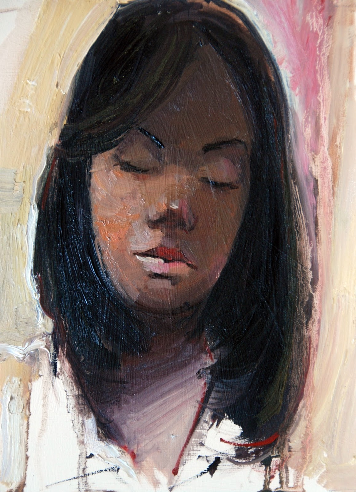
Sweet Memories, 7" x 10", coloured pencil on cardboard, 2009

This is another transformation. I sketched this guy way back last year. He was a black man, so to make this look a bit interesting I decided not to use any of the brown family of colours on this piece.


This was pretty straightforward.

1. Started sketching on a beige mount board with purple coloured pencil

2. Make sure I am satisfied with the drawing, proportion and features

3. Just start to add different colours (all colours apart form the browns) really with no particular order, only that I make sure that it has enough tonal balance through out, putting dark colours for the dark tones and light colours for the light tones.

4. I really start enjoying this and I begin to stroke with some freedom just adding a bit of expressive strokes to "jazz" it up!

5. It is at the very end that I introduce a black coloured pencil to enrich the main sketch lines and outlines of the man.

Wednesday, 25 February 2009

Lonely Londoner, 6" x 9", Oil on canvas board, 2009


This transformation was done yesterday from a sketch I did yesterday. this woman just sat in front of me like she was prepared for this.

This was tricky because I haven't attempted a three quarter figure yet and also with oils on an "Alla Prima" technique -It didn't give me my usual freedom, but this is a learning process for me too.

For this piece it was pretty straightforward

1. Give the canvas board a neutral grey background,

2. Sketch the figure in detail with charcoal pencil

3. Without wasting time I paint shape by shape with oil moving from top to bottom. The main things I note are the edges and tones.

4. Suffer when I get to the hand as my reference sketch doesn't have enough information.

5. I try to get back some drawing with the charcoal pencil but it is in vain.

6. Try to play around with haphazard strokes to unify the whole piece.

7. Have to stop because the oil is so wet all over, nothing seems to stay on again.

Tuesday, 17 February 2009

The Casual Onlooker, 9" x 12", Mixed Media, 2009

This transformation was very fresh in my memory, I sketched this guy today on my way to my studio, so immediately I got to my studio with his image still fresh in my mind I go on to produce this transformation thus:


1.I painted the gessoed card with an acrylic warm base of cadmium yellow, burnt sienna and white

2. I sketch main features with burnt sienna, I love the contrast.

3.I then start adding the basic flesh tones, first starting with the mid tones, the darks, then lights.

4.It is looking balanced value wise now, need to add details......


5.I almost end it here, but with just acrylic, I don't feel I have captured this guys spirit, he looks too casual.

6.I spice it up with some coloured pencils

7.Still lacking enough spice, I work into it to get back some drawing lines and darks with my Black Biro.

8.Then finally I add some highlights with oil pastel sticks

9. He almost still looks casual, I have to stop or I'll end up making him even more casual.